

Tableau How To Create Donut Chart
Introduction to Donut Chart in Tableau
Amongst various types of visualizations used for presenting data in an insightful manner, the donut chart stands out as one of the most preferred visualization tools. Tableau provides the functionality to build donut charts. Basically, the functionality is not directly present as a ready-made option, but the charts can be built using a combination of options. Donut charts can be considered types of hybrid charts built by employing multiple techniques that are not specifically meant for its creation. Pictorially, the chart is a variant of Pie chart with a blank hole inside, which makes it appear as a ring.
Creating Donut Chart in Tableau
For this demonstration, we are going to use the Distribution Volume dataset. Here, Region and Distribution volumes are dimension and measure, respectively. We'll build donut charts to see how distribution mode preferences change based on region.
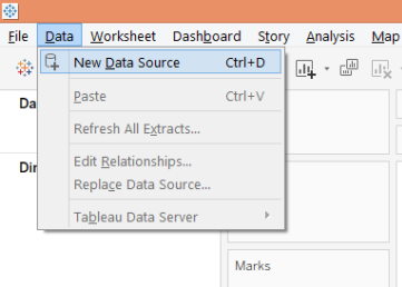
1. In the first place, load the requisite data source. Click on Data and then click on "New Data Source".
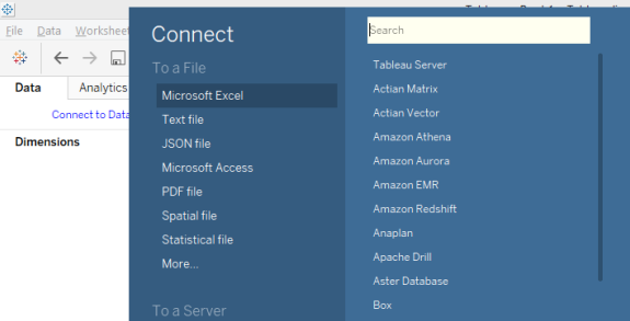
2. Select the requisite data source type. In this case, it is Microsoft Excel.
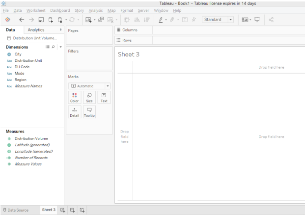
3. The loaded data appears below.
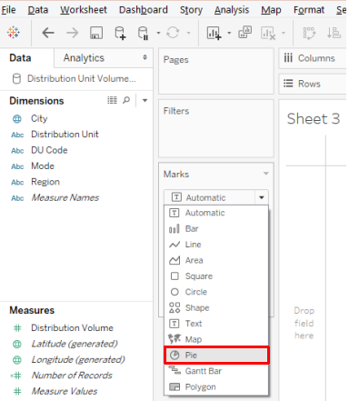
4. The default chart type is "Automatic". Change it to "Pie", as in the below screenshot.
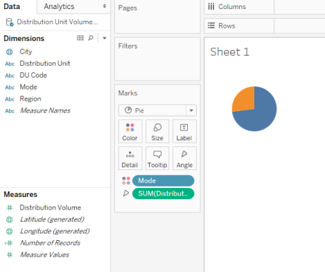
5. Once the chart type is changed to Pie, drag measure Distribution Volume over Angle and Mode over Color in the Marks card. A pie chart gets created as shown below.
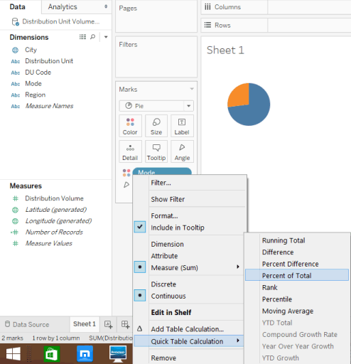
6. In a Pie chart, we want the percentage contribution of a mode to appear; for that, click on the drop-down menu of Distribution Volume in Marks card, then under "Quick Table Calculation", click on "Percent of Total" as illustrated below.
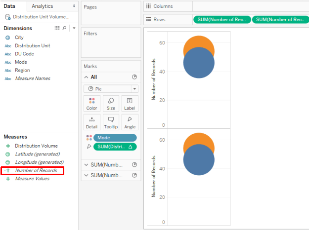
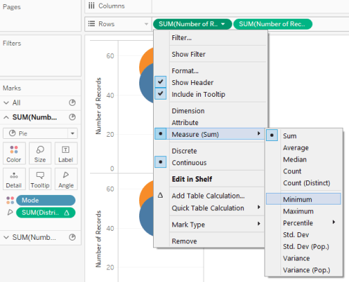
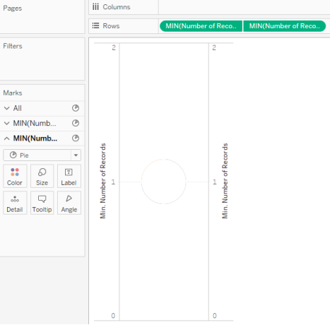
7. Now, we come to the most important step. We have a number of Records in the Measures section. Drag it twice, one-by-one, in the Rows region. The visualization changes as below.
8. Next, change the aggregation function over the Number of Records from SUM to MIN (Minimum), as shown below. Perform this step for both the Number of Records measures.
9. We get two pie charts as shown below. Now, for the second Number of Records measure in the Rows region, make the axis dual by selecting Dual Axis in its drop-down menu.
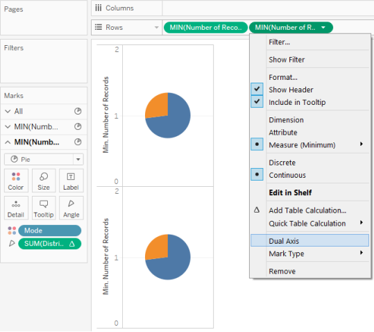
10. Selecting Dual Axis for the second Number of Records measure superimposes the two charts over each other, and so they appear as a single visualization, as can be seen in the below screenshot.
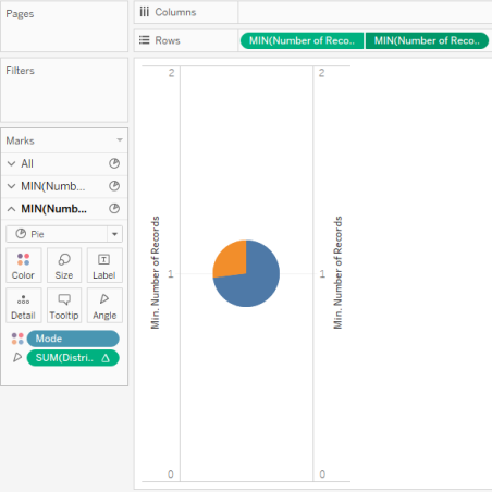
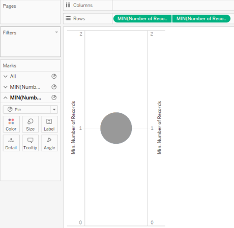
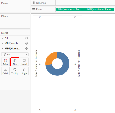
11. As a next step, remove dimension Mode and measure Distribution Volume for the second Number of Records measure from Marks card. We get a single colored pie chart, as seen in the below screenshot. The default color of the pie chart is grey; change it to white as shown in the subsequent screenshot.
12. As two pie charts are superimposed over each other, change the pie charts' size from the Size in Marks card. Increase the pie chart's size for the first Number of Records measure while decreasing it for the second Number of Records measure. We get the donut chart as shown below. This donut chart helps us understand the percentage contribution of a distribution mode in total volume distributed across all the regions. Here we have two modes, viz. M1 and L2.
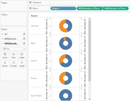
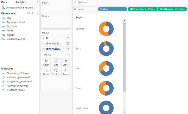
13. To get a region-wise donut chart, drag dimension Region in Rows region.
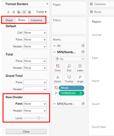
14. We successfully created donut charts using the above steps; however, as can be seen in the above screenshot, axis labels, row and column borers, and gridlines give the visualization a cumbersome look. To overcome that, we will remove these elements. For that, click on Borders in Format Menu as shown below.
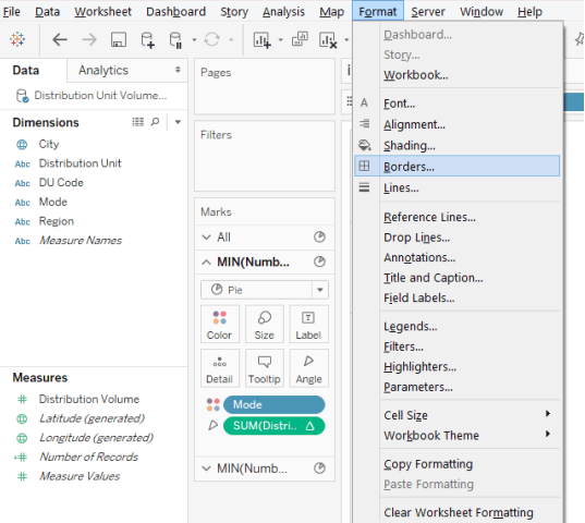
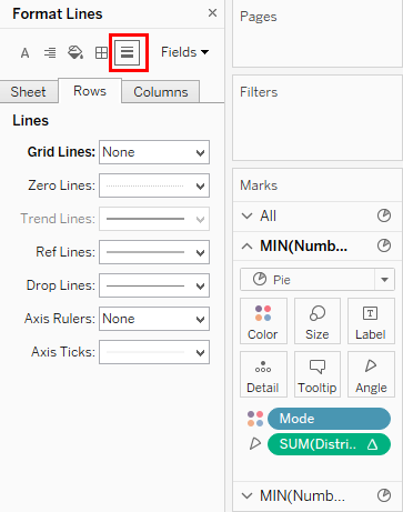
15. As demonstrated in the below screenshot, in the Format Borders section, in Sheet, Rows, as well as Columns tab, select "None" in Pane and Header in Row Divider section. Once this is done, as shown in the subsequent screenshot, click on Lines, and in Sheet, Rows, and Columns tab, select "None" for Grid Lines. If we don't want the category labels (Mode in this case) to appear, right-click on the labels and uncheck "Show Header".
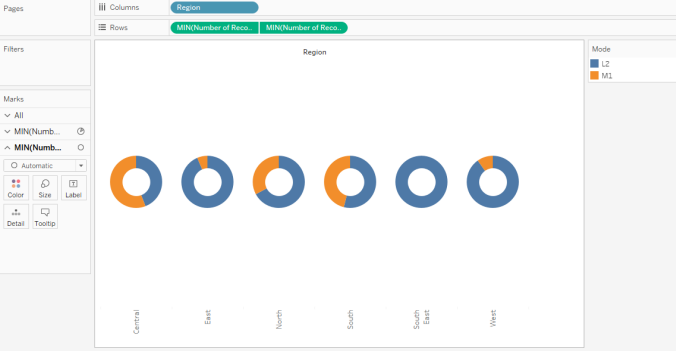
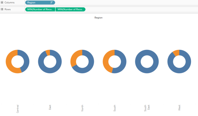
16. We have got the donut charts as we wanted, as can be seen in the below screenshot. The donut charts help us understand the region wise contribution of a distribution mode. The donut charts are positioned vertically. To have a horizontal arrangement, just drag the Region dimension into the Columns region.
17. As soon as the Region dimension is dragged into the Columns region, we get the donut charts arranged horizontally, which makes the visualization easier to interpret, and region-wise comparisons can now be made efficiently. Note, dimension Mode as a category variable appears on the right side. Two contrasting colors have indicated the modes for clear distinction and quick analysis. The colors can be changes from the Color in Marks card.
18. Now, suppose we don't want the category card on the screen, then in the drop-down menu of Mode, click on Hide Card as shown below.
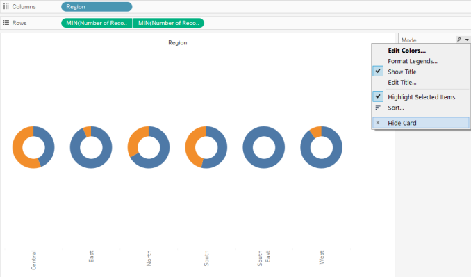
19. Performing the above steps gives us the donut charts, as can be seen in the below screenshot.
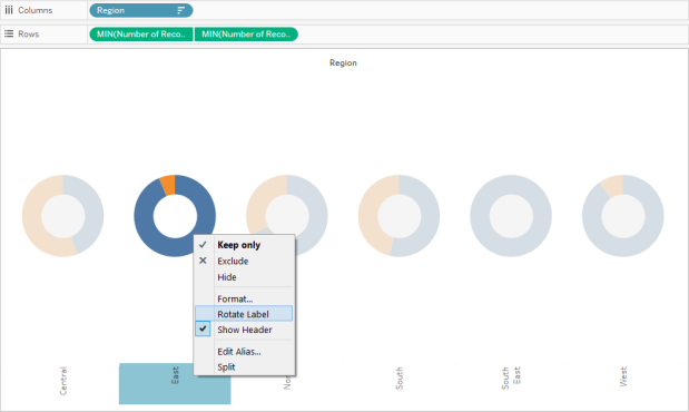
20. The Region labels are present in a vertical position. To make them horizontal, right-click on the labels, and click on "Rotate Labels", as illustrated in the below screenshot.
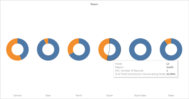
21. Labels now appear more systematic and are readable. Hovering a mouse over a portion of a donut chart for any region would give the requisite details. As shown in the below screenshot, in the South region, Mode L2 accounts for around 54% percent of the total distribution volume.
Importance of Donut Chart
A doughnut chart resembles various meters present over a car dashboard. The way the meters' readings help the driver gauge the car's performance; similarly, the doughnut chart helps track important KPIs pertaining to a business or an activity. The inner blank space that basically converts a pie chart into a doughnut chart has a special significance. The blank space can be used to write a meaningful and insightful label that helps the business user understand the doughnut chart's insight from the data. Moreover, compared to a pie chart, the donut chart is visually appealing, especially when multiple categories are compared.
Conclusion
A doughnut chart, whose shape resembles that of a doughnut, is a very effective and powerful visualization tool, especially to present the percentage contributions of multiple categories. In Tableau, beautiful donut charts can be built, which requires working upon two similar pie charts. The chart is quite useful for tracking performance measures.
Recommended Articles
This is a guide to Donut Chart in Tableau. Here we discuss how to create a donut chart in tableau along with its importance. You may also look at the following articles to learn more –
- Gantt Chart in Tableau
- Tableau Storyline
- Bubble Chart in Tableau
- Tableau Reference Lines
Tableau How To Create Donut Chart
Source: https://www.educba.com/donut-chart-in-tableau/
Posted by: eckmanonswity.blogspot.com
0 Response to "Tableau How To Create Donut Chart"
Post a Comment